COLOUR as a Storyteller: Unleashing the Power of COLOUR in Illustration
Welcome to the World of Colour!

Colour has an incredible ability to evoke emotions and tell stories. As someone who has always struggled to pick a favourite colour, I understand the challenge of choosing the right hues for your illustrations. In this post, I’ll share my insights on colour and how I’ve incorporated it into my own artwork. Let’s embark on this colourful journey together!
Photo Credits - Richard Bell
The Language of Colour: Understanding Its Meaning
Colours can convey a multitude of emotions and meanings. For example, blue often brings a sense of calm, while orange radiates energy and liveliness. However, the significance of colour can vary widely across cultures. In Western societies, red might symbolize love and passion, but it can also represent anger and danger. In contrast, in China, red is a symbol of luck, joy, and celebration. Similarly, yellow in India signifies prosperity and purity, often gracing wedding celebrations, while white carries similar connotations in Western cultures. Understanding these cultural nuances can enrich your storytelling through colour.


Crafting Your Colour Palette
So, how do you harmonize all these colours and hues in your illustrations? A great starting point is creating a colour palette before diving into your artwork. You might choose to stick with a consistent palette across your pieces or create a new one tailored to each illustration. Here are some common types of colour palettes to consider:
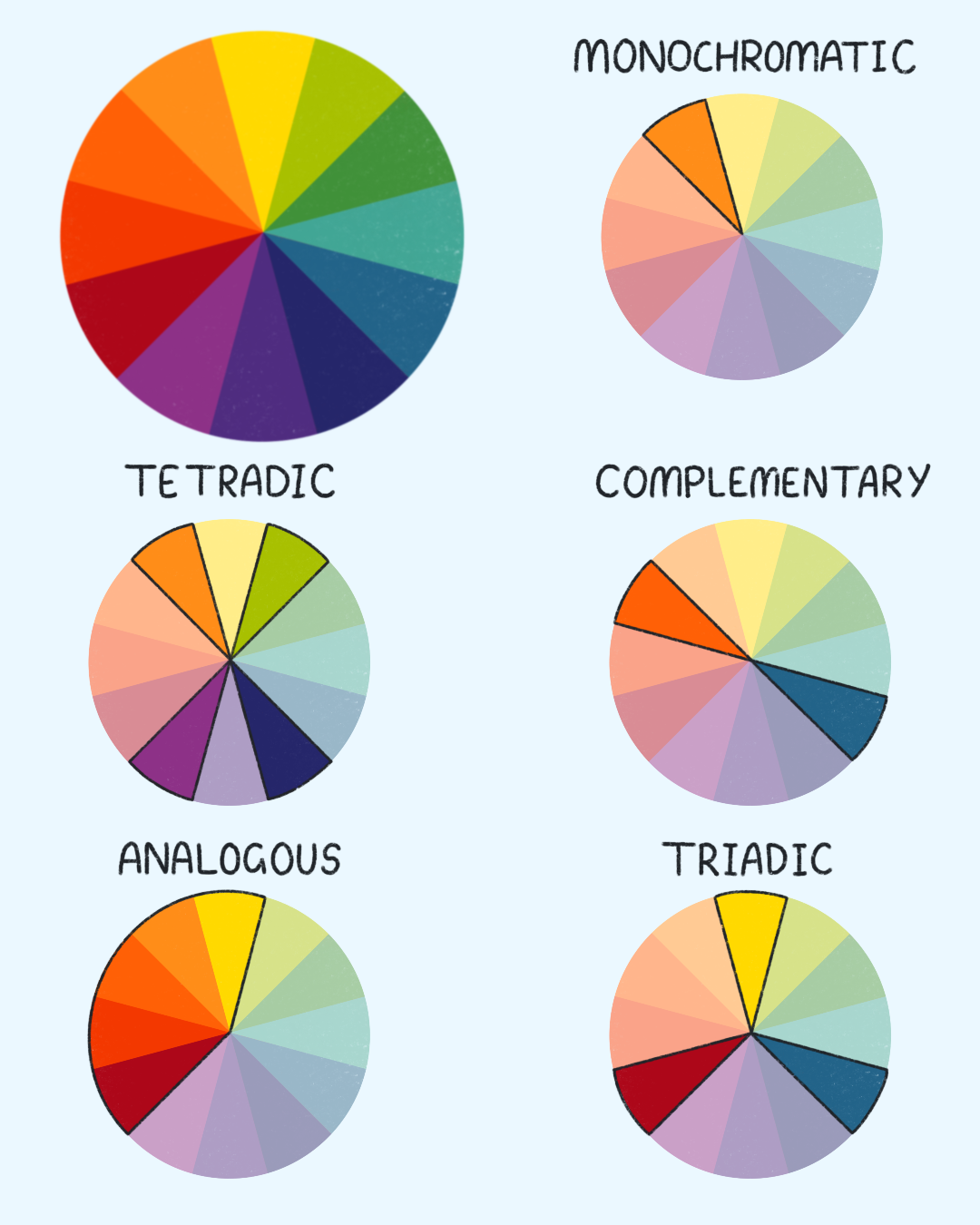
Monochromatic: Using variations of a single colour.
Analogous: Combining two or three colours that are next to each other on the colour wheel.
Complementary: Pairing colours from opposite sides of the colour wheel.
Triadic: Selecting three colours that are evenly spaced around the colour wheel.
Tetradic: Incorporating four colours that are two complementary pairs.
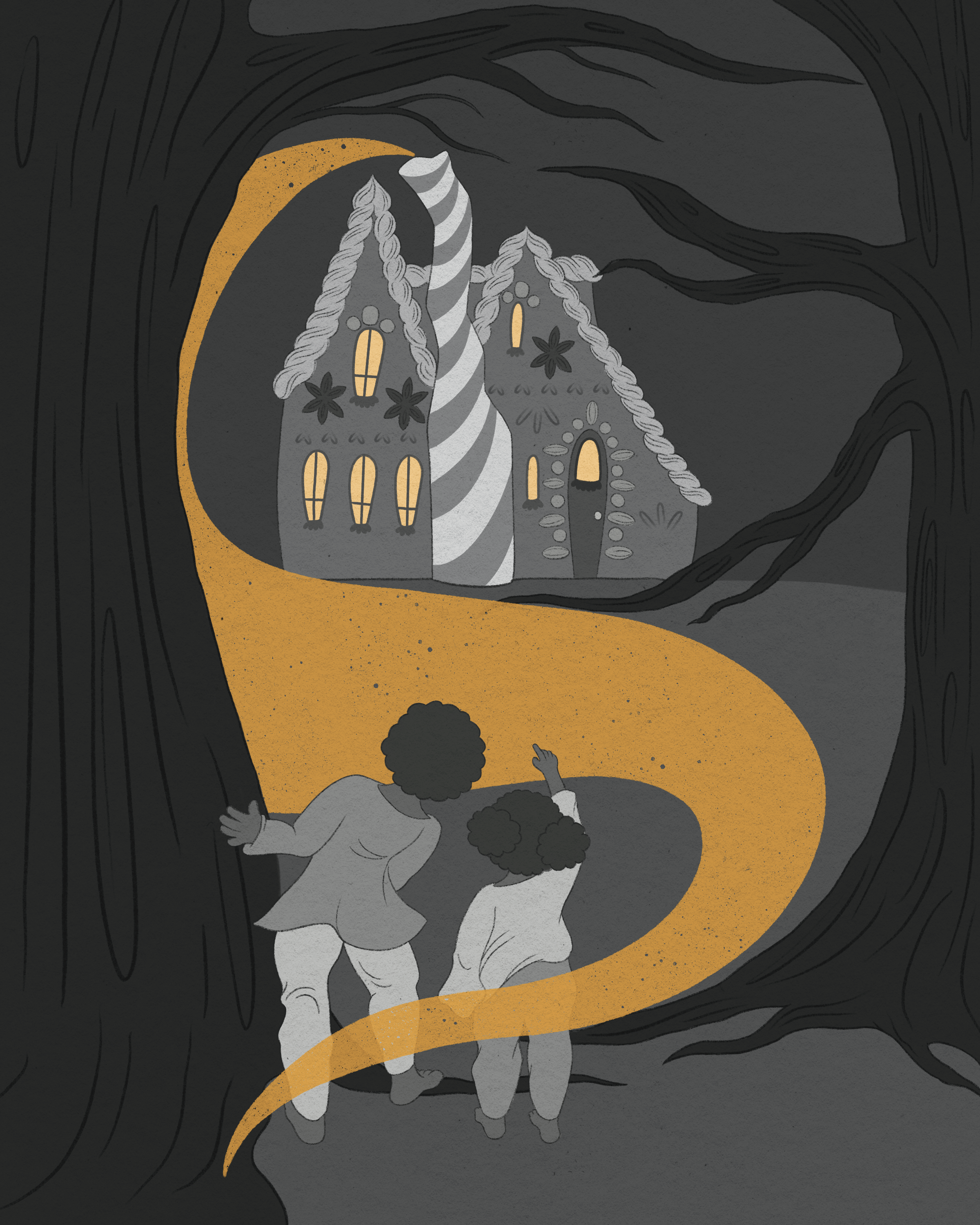
In my own illustrations, I often blend triadic and tetradic palettes. However for Halloween-themed pieces, I love using monochromatic and complementary colours to create a spooky atmosphere, with splashes of orange guiding the viewer's eye and enhancing the narrative.


Navigating these colour palettes can be complex, and I’ve certainly faced my share of confusion. A helpful tip is to combine two light colours, a dark colour, two medium colours close on the colour wheel, and an accent colour. This approach can help you achieve a balanced and harmonious colour palette.
My Artistic Approach
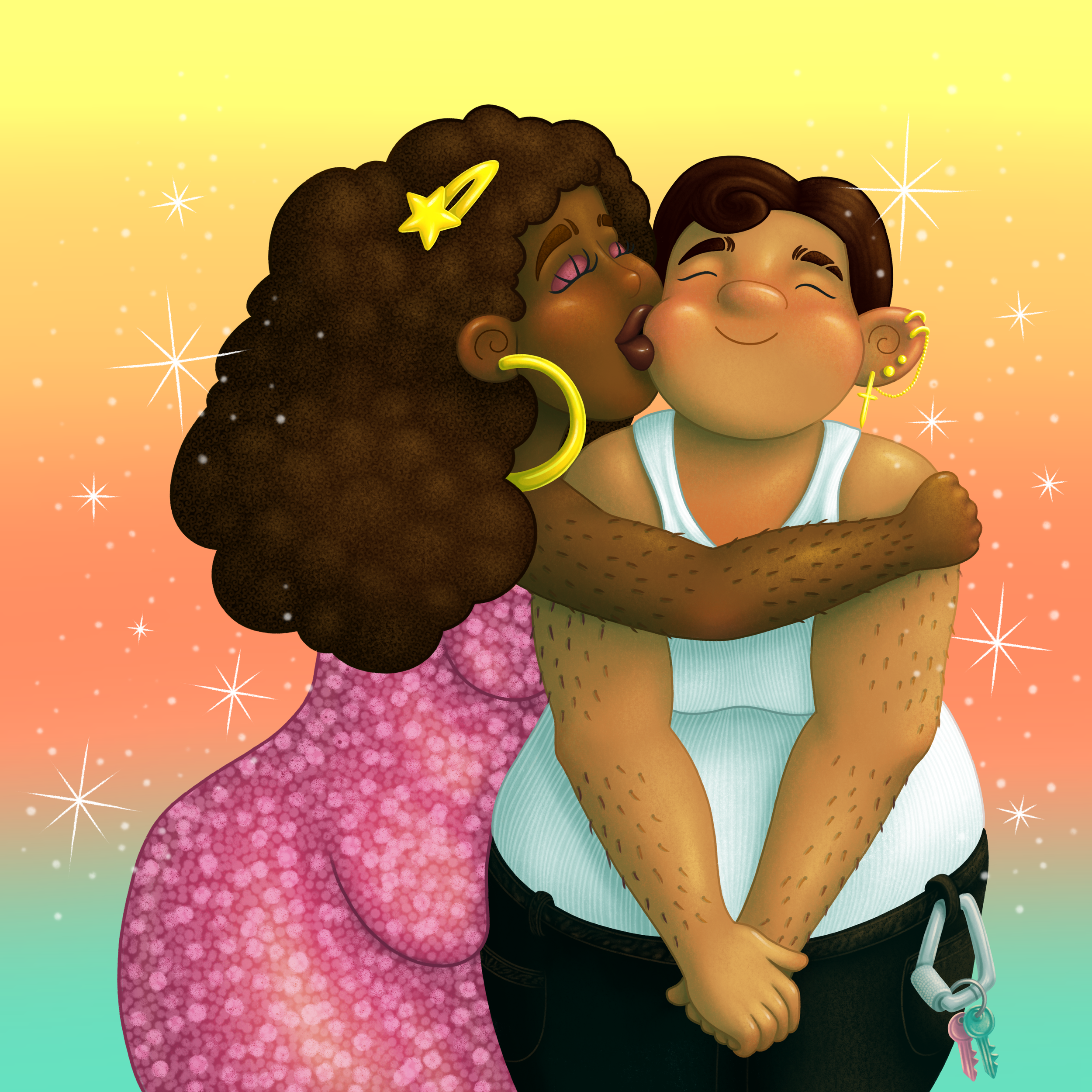
I tend to gravitate towards warm and vibrant colours for my illustrations, as my artwork often celebrates joy and togetherness. For instance, in one of my illustrations, the warm sunset hues evoke a romantic vibe, with pink symbolizing femininity and happiness. I also enjoy incorporating accents of blue to create balance and draw the viewer’s attention.

But feel free to experiment with your palette! Sometimes, a dominant blue can take centre stage in my work, with warm colours serving as accents. The beauty of colour is that there are no strict rules, only possibilities!
Embrace the Complexity of Colour
As you can see, colour is a complex and sometimes challenging aspect of illustration. While I certainly don’t have all the answers, I hope this post provides insight into how artists choose their colours and inspires you to experiment with colour in your own artwork.
If you’re an illustrator or artist, I’d love to hear how you use colour in your work! Feel free to share your thoughts here or connect with me on Instagram @joelymaria_illustration, where you can explore my illustrations, behind-the-scenes content, tips, and inspiration. Thank you for joining me on this colourful adventure!